Choosing Paint Colors for Your Home Renovation
Choosing a paint color may seem simple, but the wide range of options can be daunting. For instance, one shade of blue might create a calming atmosphere, while another could feel less welcoming. A warm beige may look perfect in the store, but it might turn yellow once it’s on your walls. So, how do you select the right color for your space?
Paint is not just about looks; it also affects mood and how we perceive space. The right color can make a home feel inviting, energizing, or calming. This guide will help you choose colors that enhance your home’s style, lighting, and purpose.
How Color Affects a Room’s Atmosphere
Colors not only change a room’s look, but they also affect our emotions. Think about the last time you entered a deep red dining room or a soft blue bedroom; the color set the mood for the whole space.
- Warm colors (reds, oranges, yellows) create a cozy, inviting feel. They work well in social spaces like living rooms and dining rooms because they encourage conversation.
- Cool colors (blues, greens, purples) have a calming effect. These are great for bedrooms and bathrooms where relaxation is key.
- Neutrals (beige, gray, white) provide flexibility. They create a timeless backdrop that allows furniture and decor to stand out.
Research indicates that restaurants often utilize red and orange colors to stimulate appetite and foster a vibrant atmosphere for diners. Conversely, offices and hospitals tend to prefer blue and green hues, which aid in concentration and relaxation.
Consider an Accent Wall
Creating an accent wall is an excellent solution if you’re moving into a new home or want to add personality to a space without fully committing to a bold color scheme. An accent wall—one wall painted a different color than the others—can highlight architectural details, define a space in an open floor plan, or serve as a focal point in the room. In Austin homes, styles range from modern minimalism to rustic Texas charm, and accent walls can complement both. Here are a few ways to incorporate them:
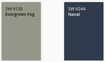
Living Room Accent Wall Color Ideas. Deep green or navy in a living room with natural wood and leather for a modern yet warm feel.
- Evergreen Fog (SW 9130) – A soft, muted green with an earthy, organic feel.
- Naval (SW 6244) – A deep navy that adds richness and depth.
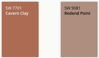
Dining Room Accent Wall Color Ideas. Earthy terracotta behind a dining area to bring in Southwest-inspired tones that complement limestone or exposed brick.
- Cavern Clay (SW 7701) – A warm, earthy terracotta with a desert-inspired feel.
- Redend Point (SW 9081) – A muted, natural clay tone that feels cozy and welcoming.
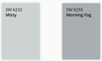
Bedroom Accent Wall Color Ideas. Muted blue-gray in a bedroom for a calming, restful backdrop behind the bed.
- Misty (SW 6232) – A soft, blue-gray with a light and airy touch.
- Morning Fog (SW 6255) – A balanced gray with subtle blue undertones for a relaxing feel.
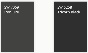
Home Office or Den Accent Wall Color Ideas. Dark charcoal or black in a home office adds sophistication and depth without overpowering the space.
- Iron Ore (SW 7069) – A deep charcoal gray that feels modern and dramatic.
- Tricorn Black (SW 6258) – A genuine, bold black that makes a striking statement.
An accent wall works best by enhancing the room’s features rather than competing with them. It can also be a great way to use bolder colors that might feel overwhelming on all four walls.
Best Paint Colors Based on Room
To make choosing easier, here are some tried-and-true Sherwin-Williams paint colors that work well in different areas of the home. Most paint stores can provide a similar color match if you’re using another brand.
Living Room & Common Areas Colors
These spaces should feel warm and inviting. The best colors are warm neutrals and soft earth tones that make guests comfortable.
- Accessible Beige (SW 7036) – A light, warm beige with a modern feel.
- Evergreen Fog (SW 9130) – A soft, muted green that adds a natural touch.
- Repose Gray (SW 7015) – A versatile, light gray that works with almost any decor.
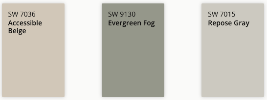
Avoid dark colors unless you’re going for a dramatic, moody look.
Kitchen Colors
Kitchens benefit from bright, energizing colors that make the space feel fresh. Warm neutrals and soft yellows work well, while cooler shades sometimes feel uninviting.
- Alabaster (SW 7008) – A warm white that feels clean but not sterile.
- Butter Up (SW 6681) – A cheerful, soft yellow that adds warmth without overpowering.
- Redend Point (SW 9081) – A muted, earthy red that feels cozy and welcoming.
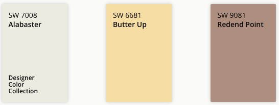
Avoid cool grays and blues, which can make a kitchen feel cold.
Bedroom Colors
Bedrooms should have soothing, muted tones that feel soft and relaxing for restful sleep. Blues, greens, and warm neutrals are great choices.
- Sleepy Blue (SW 6225) – A soft, dusty blue with a tranquil feel.
- Sea Salt (SW 6204) – A pale greenish-blue that works well with natural light.
- Natural Linen (SW 9109) – A warm, light neutral with a cozy undertone.
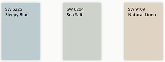
Avoid overly bright or bold colors, which can be too stimulating for a restful space.
Bathroom Colors
Bathrooms should feel clean and spa-like, so crisp whites, soft grays, and gentle greens are great choices.
- Pure White (SW 7005) – A true white that feels fresh and modern.
- Silver Strand (SW 7057) – A soft gray with blue-green undertones for a subtle coastal vibe.
- Rainwashed (SW 6211) – A soothing green-blue that pairs well with white trim and tile.
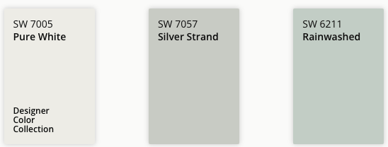
Avoid dark or heavily saturated colors in small bathrooms, as they can make the space feel even smaller.
Home Office Colors
The ideal home office color should promote focus and productivity without feeling too stark. Greens and blues help concentrate, while warm neutrals add a grounded feel.
- Naval (SW 6244) – A deep navy that adds sophistication and depth.
- Acacia Haze (SW 9132) – A soft green-gray that feels natural and balanced.
- Agreeable Gray (SW 7029) – A popular neutral in any office setup.
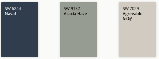
Avoid overly bright colors that might be distracting during work.
We’re Here to Help with Paint Projects & More
Choosing the right paint color is the first step—getting a flawless, professional finish makes all the difference. At Best Austin Handyman and Remodeling, we help homeowners bring their visions to life with expert painting services and home renovations.
Contact us today to get started on your next home improvement or painting project!